Modal
Keeps the user's focus inside a pop-up until dismissed
Principles
Clarity
Use modals only when needed for focused tasks, and keep the content short and easy to understand.Easy interaction
Modals should be simple to open and close without disrupting the user’s flow.Accessibility
Make modals accessible by using proper ARIA roles, labeling, and managing keyboard focus.- Responsive design
Design modals to work well on all screen sizes and avoid overwhelming users with too much content.
Usage
Use modals to:
- Have the user focus on a specific task
- Prevent background interactions until the user addresses the modal
- Display additional information without leaving the current page
Best practices
Do
- Use field validation and clear error messages when using form elements in a modal
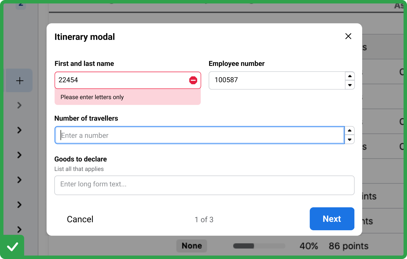
- Break into smaller steps by using a multi-step modal if content is long and complicated
Don't
- Create a modal with a fixed height or width that won't adapt to different screen sizes
- Overload with content (avoid large tables, long texts, or full-page forms inside a modal)
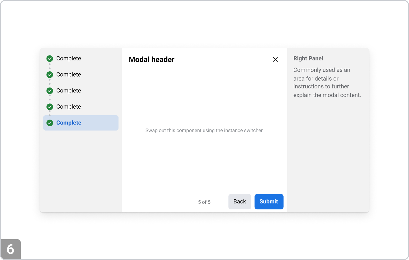
Anatomy
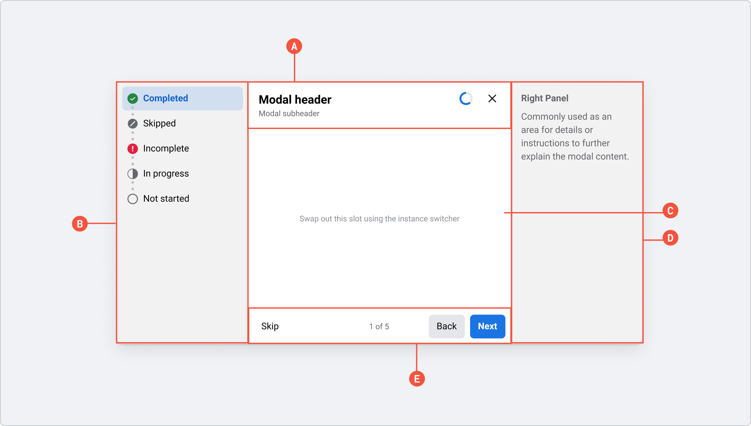
- A. Header (Required): Contains Title and close button, as well as optional elements description or loader
- B. Left Panel (Optional): Contains supporting information, such as Table of Contents
- C. Body (Required): Contains primary task or message
- D. Right Panel (Optional): Contains supporting information
- E. Footer (Optional): Contains navigation and pagination for multi-step Modals
Types
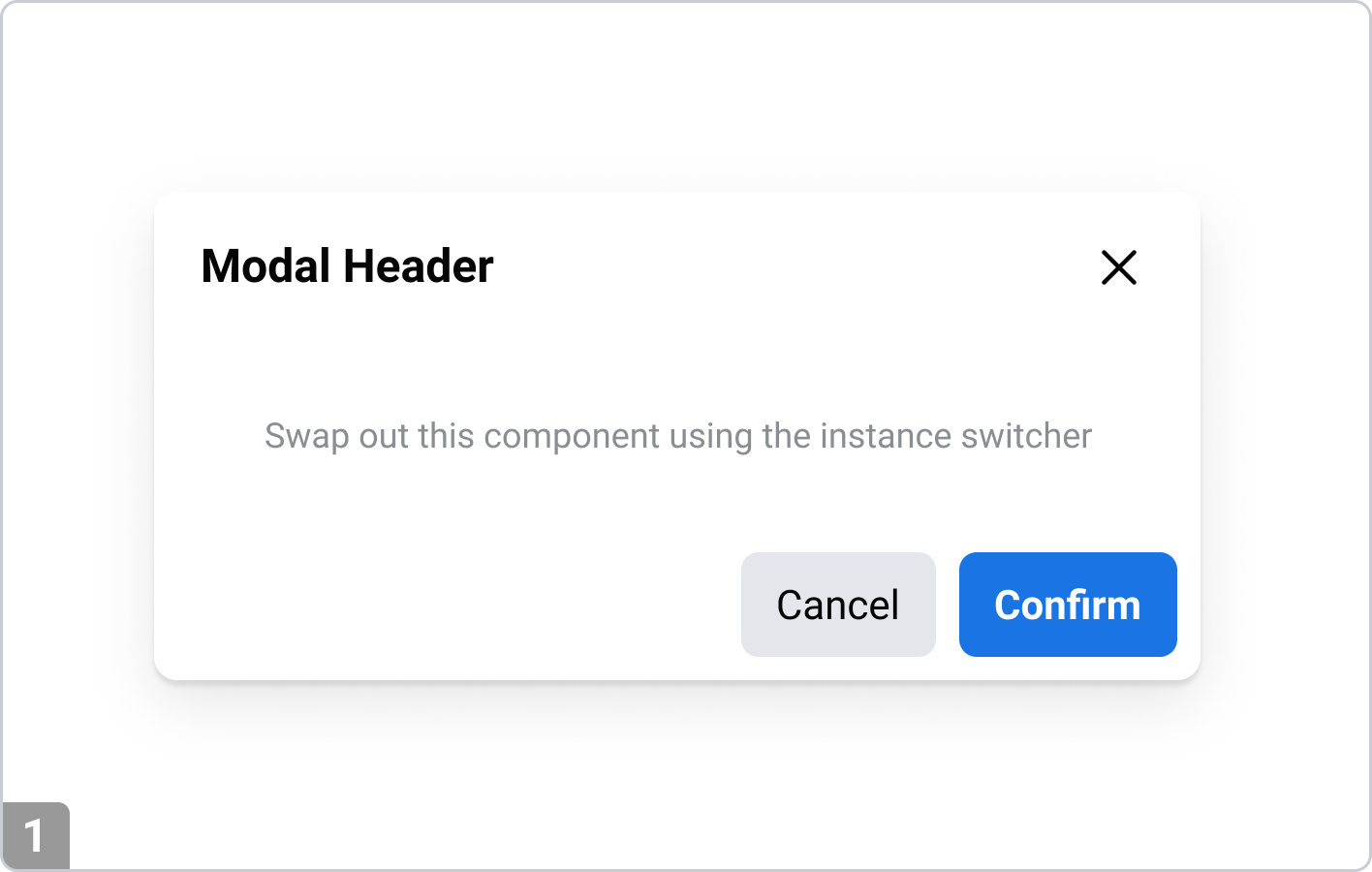
Modal
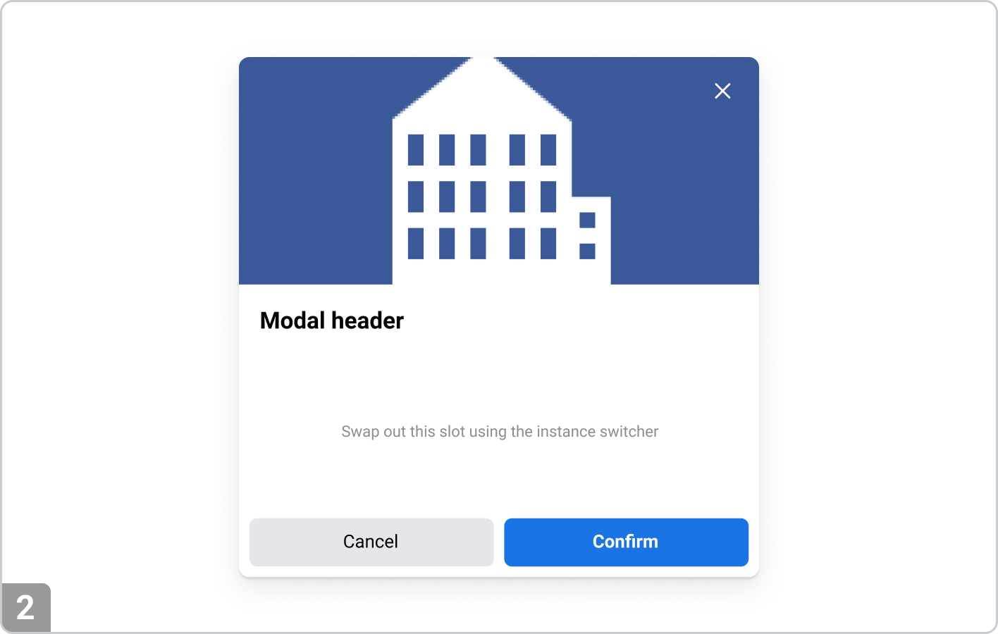
Modal with image
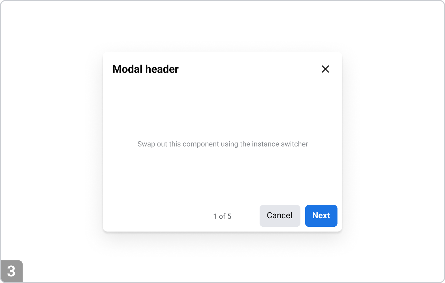
Multi-step modal
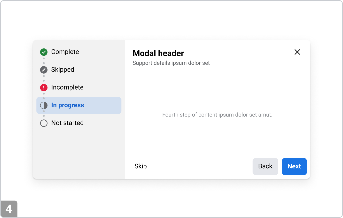
Multi-step modal with left panel
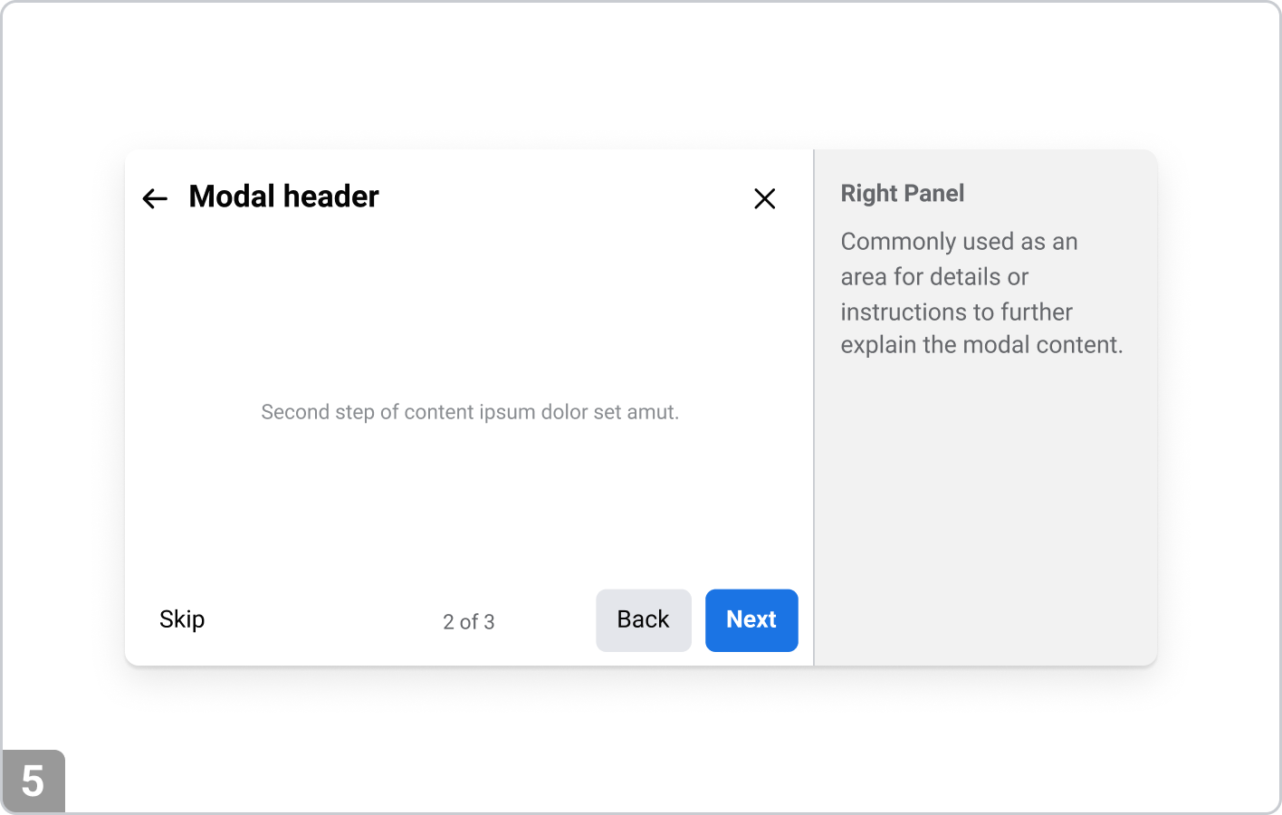
Multi-step modal with right panel
Multi-step modal with left and right panel
Variations
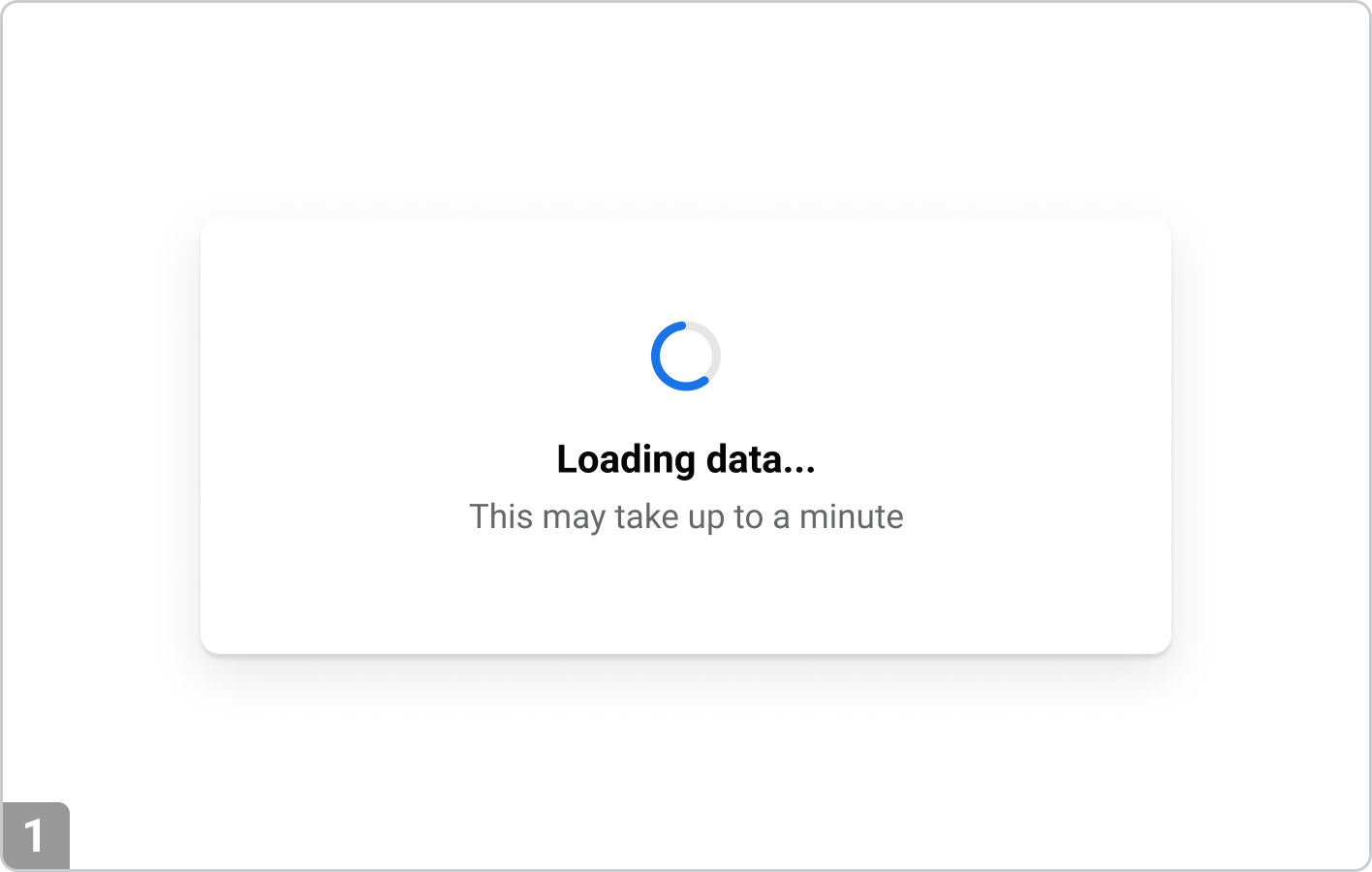
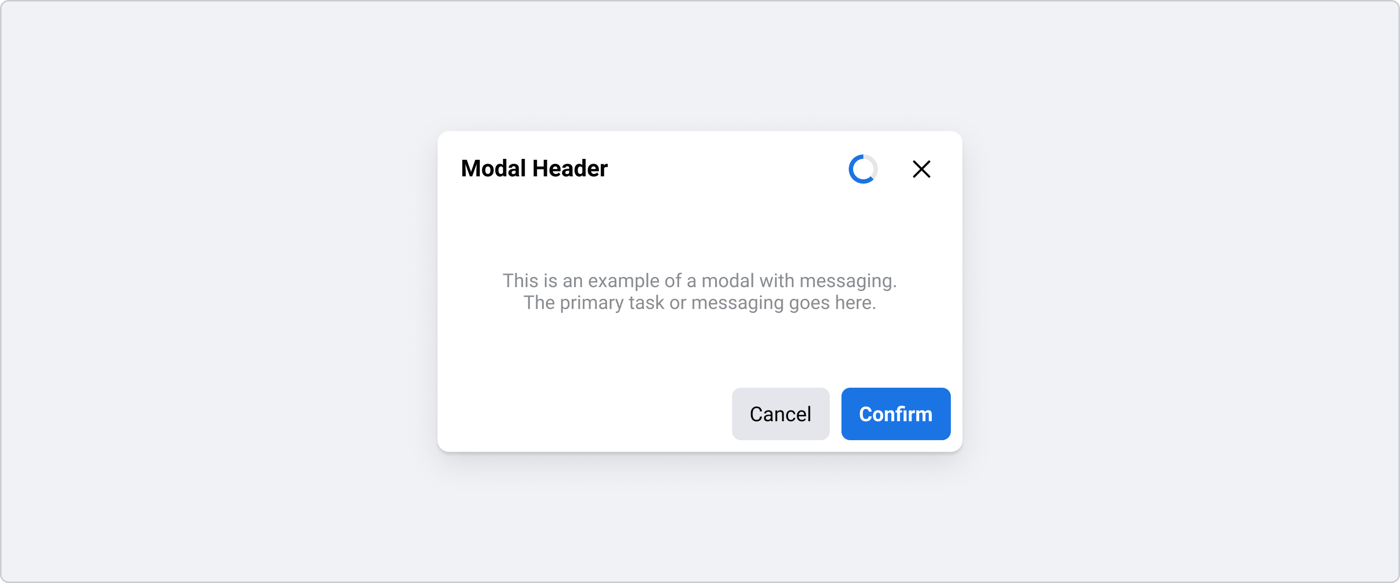
Loading modal
Used to block user interaction during critical process, such as submitting a form or processing a payment. If a process takes longer than a minute, consider using progress bar instead of spinner.
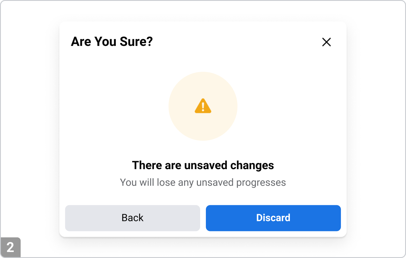
Confirmation modal
Requests user confirmation for actions with significant consequences, such as deleting a user account or leaving a page with unsaved changes.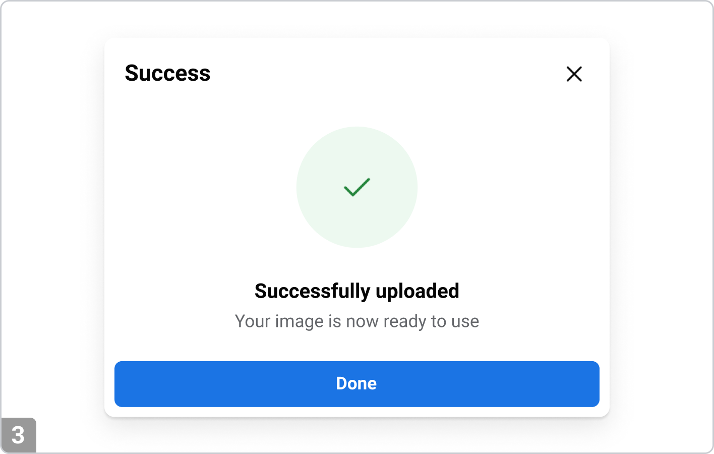
Warning modal
Alerts users to potential data loss or security issues that require immediate resolution, such as a user session is about to expire due to inactivity.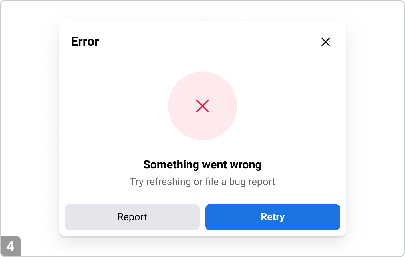
Error modal
Informs users of a problem that prevents further action, such as form submission errors.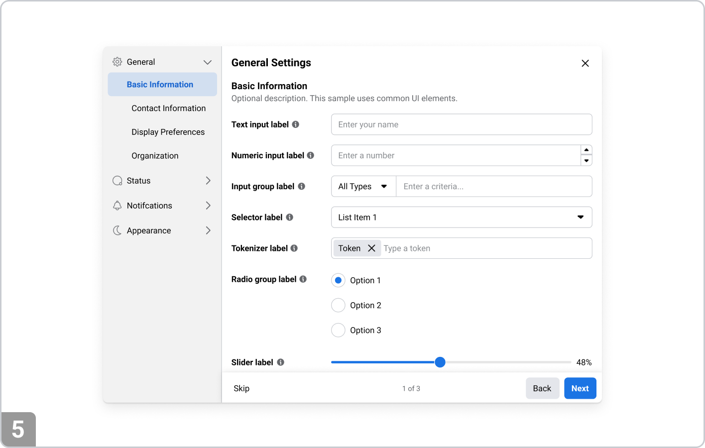
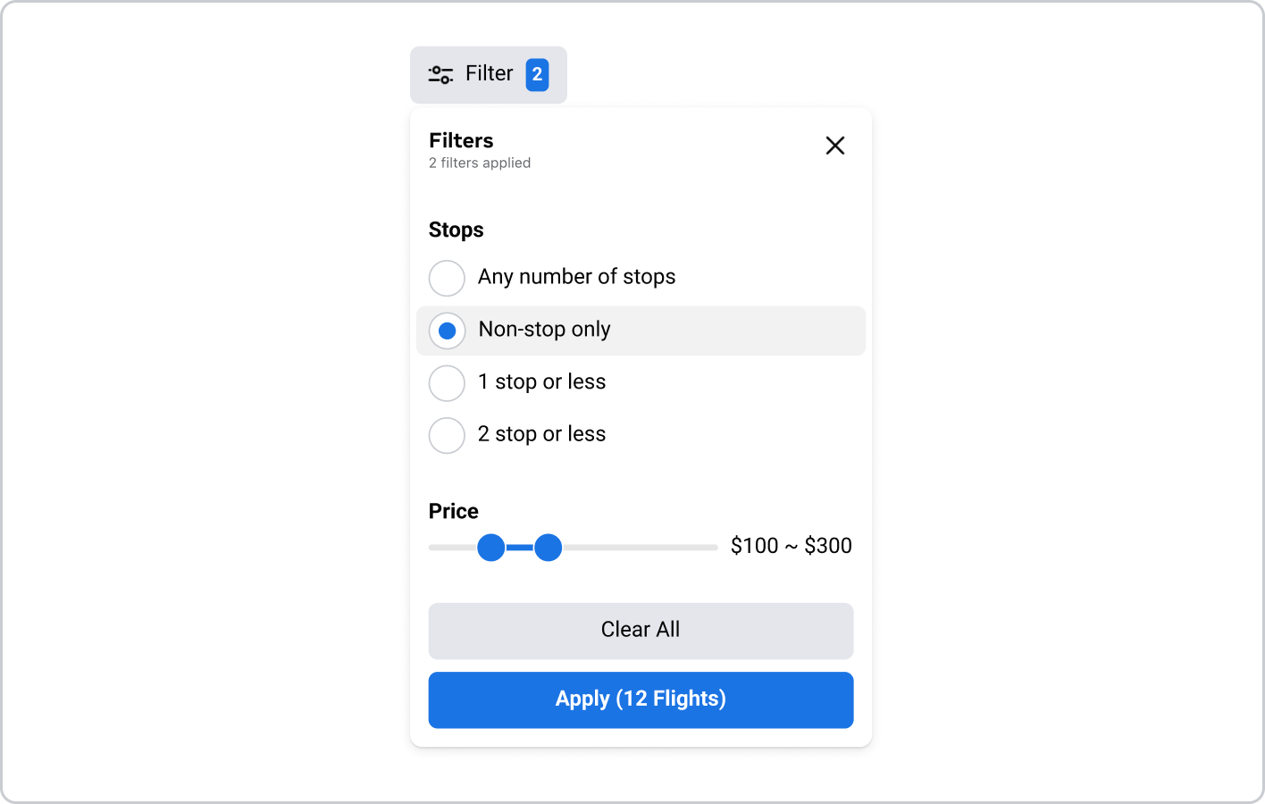
Settings modal
Used for quick adjustments related to the settings of the specific app, tool or product being used.Content Guidance
Keep content concise
• Give the modal a meaningful title or heading
• Limit the amount of content to prevent cognitive overload
• Use clear, simple language—especially for alerts or confirmationsActionable buttons
• Always include a primary action (e.g., “Save,” “Confirm,” “Delete”) and a secondary action (e.g., “Cancel,” “Close”)
• Ensure button labels are descriptive and represent the action clearly (e.g., “Delete” instead of just “OK”)
Accessibility Guidance
Indicate a modal has opened
• Use visual cues like dimmed backgrounds or overlays
• Set focus on the first interactive element (e.g., the modal’s close button or first input)
• Visually and programmatically (with aria-modal="true" or aria-hidden="true") disable interaction with page content behind the modal • Avoid scroll bleed (disable background scrolling while modal is active).Provide close mechanism
• Include a visible "Close" button.
• Ensure the close control is keyboard-accessible (Tab, Enter, Esc)
• Label icon-only buttons with aria-label or titleFocus
• Use a focus trap to prevent users from tabbing to elements outside the modal
• Support both forward (Tab) and reverse (Shift+Tab) navigation
• After closing the modal, return focus to the element that triggered it (e.g., a button).Ensure Keyboard Accessibility
• All modal interactions should be possible via keyboard
• Pressing Esc should close the modal (unless modal is critical and requires a decision)Use Proper ARIA Roles and Attributes
• Use role="dialog" or role="alertdialog
• Label the modal with aria-labelledby or aria-label
• Use aria-describedby for supporting descriptions, if neededSupport Screen Readers
• Modal should be announced properly upon opening
• Ensure semantic HTML structure inside the modal (e.g., headings, landmarks)
Related Components
Popover
A popover dialog is a small, non-blocking UI element that appears near a triggering element to provide additional information or options without interrupting the user's flow. Unlike a modal, which typically requires the user to interact with it to close before returning to the page, a popover is less intrusive and can be dismissed by clicking outside or interacting with its content.
Common search terms: Dialog, Popover, Popup