Skills
- Product design
- Prototyping
- User interviews/workshops
Tools
- Figma
- Meta internal workplace tools
"People with disabilities represented 6% of the U.S. Meta workforce, up from 4% the previous year. About 75% of teams at Meta work remotely."
Embracing Change Through Inclusion
Meta’s 2022 Diversity Report
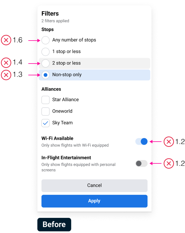
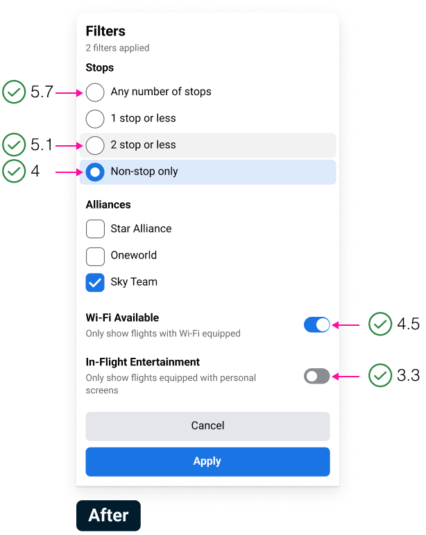
In 2023, I initiated an accessibility project to improve the contrast and visibility of interface elements in Meta workplace tools, ensuring inclusivity for employees with visual impairments or low vision. Accessibility is key to creating an inclusive work environment, fostering diversity, and enabling employees to work independently, boosting job satisfaction and productivity. Meta has committed to becoming fully compliant by 2025.
Goals
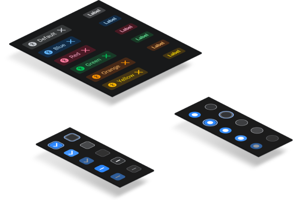
Color contrast
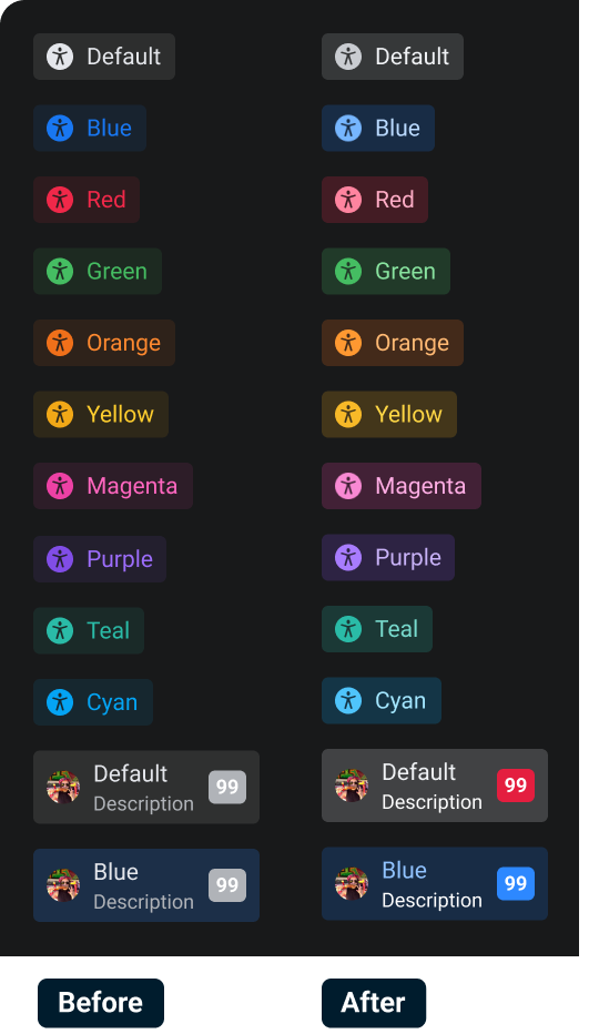
Increasing contrast in foreground and background elements to achieve a sufficient color contrast ratio (3:1 or higher, as defined by Web Content Accessibility Guidelines).
Visual hierarchy
Ensuring consistent design system application and clear visual hierarchy, helping users quickly understand the relationship and importance of different elements.
Process
- 1. Collecting user feedback and identifying problem areas
- 2. Auditing color contrast scores
- 3. Collaborating with engineers to implement changes
- 4. Gathering feedback and iterating
Design
Outcome
Feedback from employees was overwhelmingly positive. Many reported that the increased contrast made it significantly easier to interact with workplace tools, resulting in improved usability and productivity.