Skills
- Product design
- Interaction design
- UX Research/interviews
- Accessibility standards
Tools
- Figma
Background
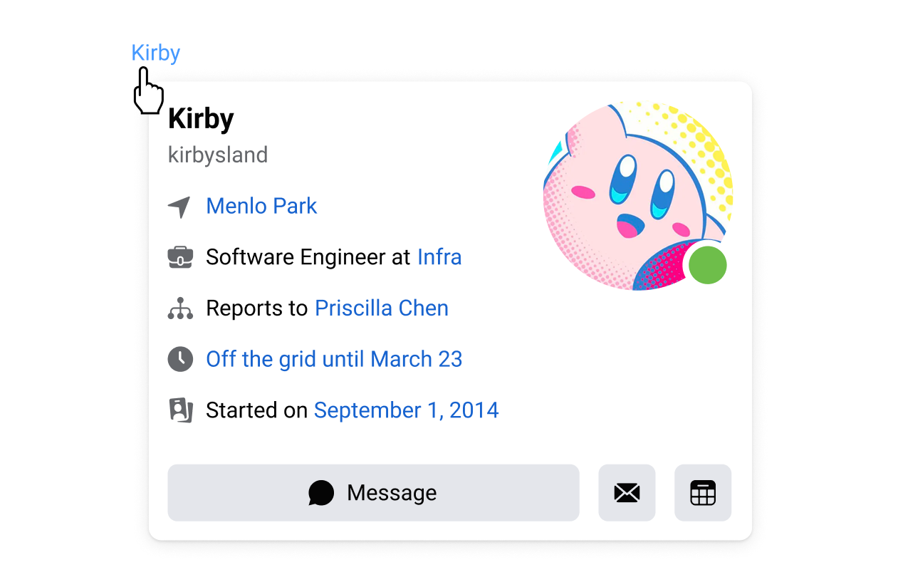
The Hovercard is a desktop web component from Meta's xDesign System (a design system used by employees to develop Internal Tools) that appears when the user hovers over an element with the mouse (similar to a tooltip, but with interactive content). It was developed internally by engineers to simplify actions such as content previews by eliminating the need for extra clicks. This component became widely used and highly valued. In 2023, Meta set a goal to make its products as accessible as possible by 2025, starting with design system patterns and components. However, the Hovercard presented an accessibility challenge because it relied on the ARIA (Accessible Rich Internet Application) role of a Tooltip, which is known to have accessibility limitations. The goal of this project is to improve accessibility of this component for employees with disabilities.
Target users
Physical or motor skill-impaired
Employees who struggle with using a mouse and rely on keyboard shortcuts, tagging, or screen readers often miss out on content that is triggered by hovering.
Blind or visually impaired
Employees with visual impairments, who may require higher color contrast, larger text sizes, or depend on screen readers, might not be able to access hover elements.
Process
Research & interviews
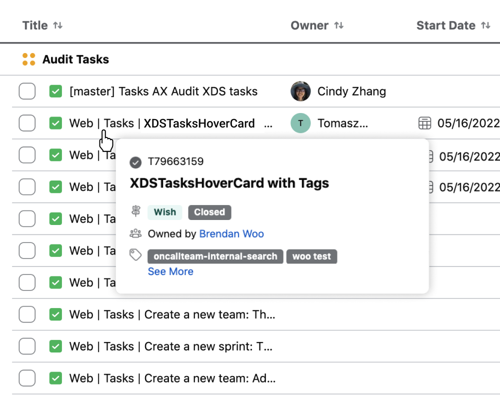
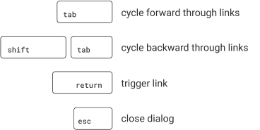
I conducted an audit of HoverCard instances within Meta's internal tools to assess the different types and understand what products they were being used in. I also met with the Central Accessibility Team to understand how they measure compliance and reviewed MVA flows (Minimum Viable Accessibility) to see examples of HoverCards in products that were considered low or non-functional. Finally, I interviewed engineers who built and used Hovercards regularly to gain insights into its functionality and construction. From this research, I was able to determine key requirements for an updated HoverCard: a close button, ARIA roles and keyboard focus.
Ideation & design
I brainstormed low to high-effort solutions and did design explorations. After reviewing with engineers, we refined a few solutions into one and lessened the scope to primary HoverCard types to make sure we were making the biggest impact given the level of effort.
Solution
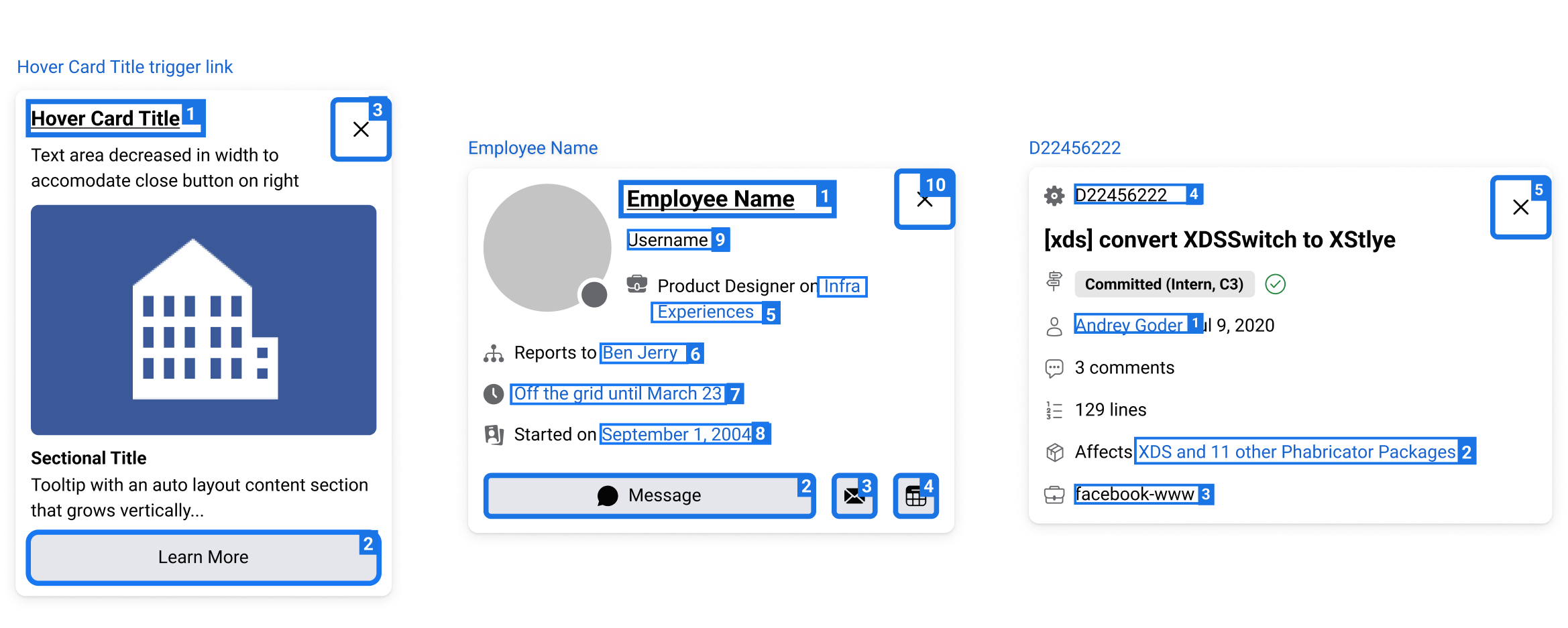
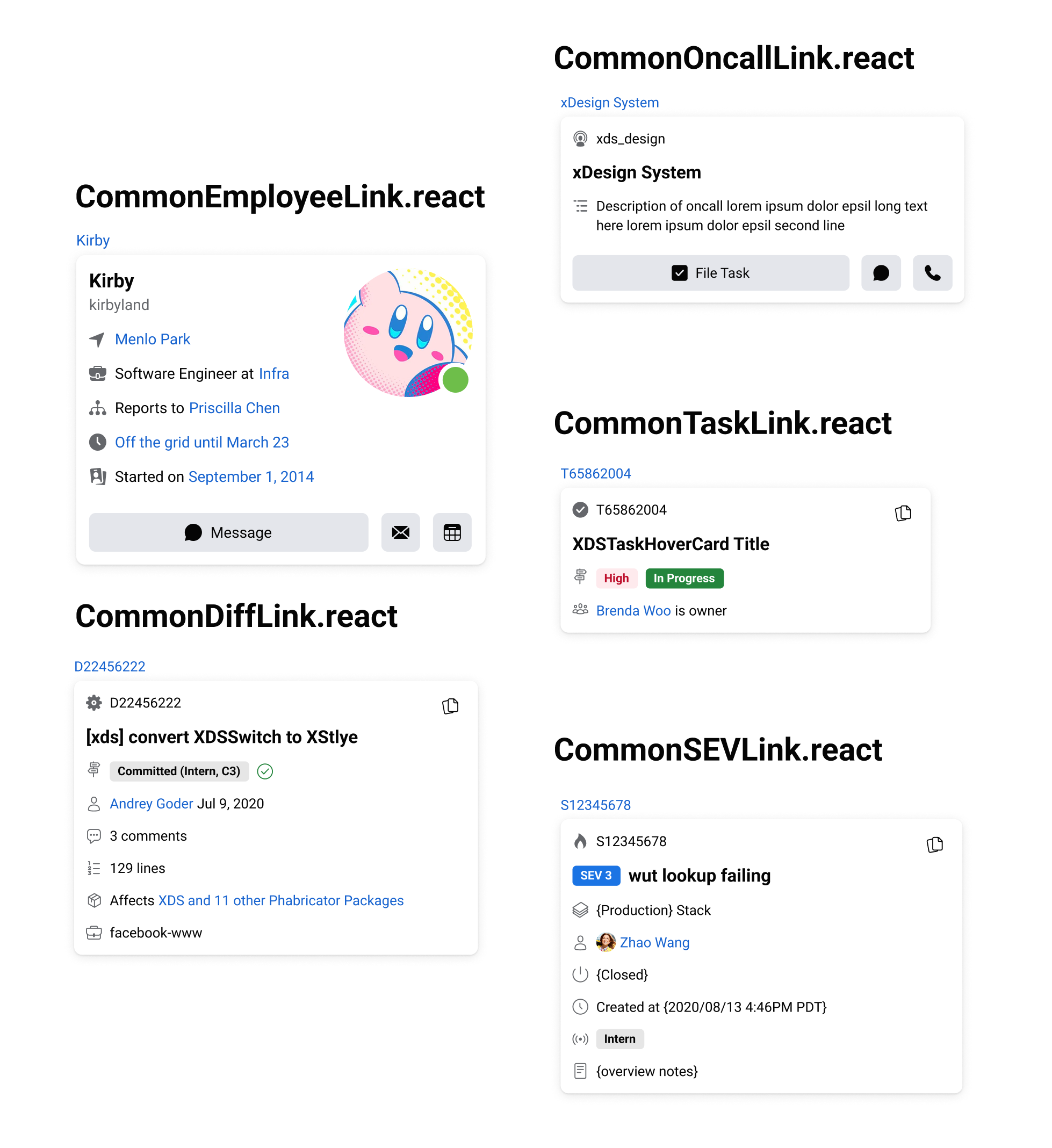
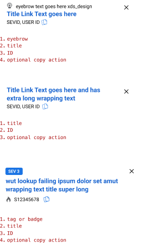
Rebuilding the Hovercard component using an ARIA Dialog. We did this for 3 main types seen below, based on highest adoption rate, usage and MVA score.
The updated version includes:
- Close button
- Keyboard focus and tabbing order
- ARIA interaction attributes
- Anatomy changes
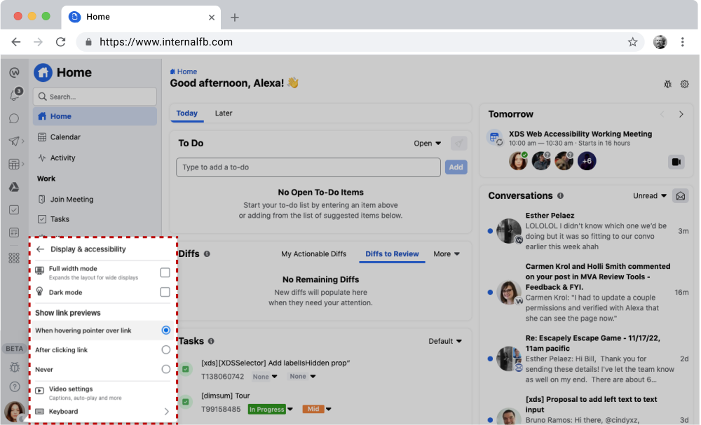
In a separate project in 2022, HoverCard settings were being tested in different Display and Accessibility Settings locations on Internal Facebook to allow a user to modify their HoverCard settings. Clicking "Show link previews - After clicking link" would, in theory, change the HoverCard so that it becomes a clickable element–and keyboard accessible–rather than hover-only.